

An offer, a clear signup form and an easy-to-find close button give shoppers a choice without losing their place.
An email popup can invite a shopper into a useful relationship. It can also interrupt the first product they came to see. The difference is often less about the popup's color than when it appears, what it asks, and what happens after the customer signs up.
HustlePop: Email popup is a Shopify popup builder with a drag-and-drop canvas, rules based on delay, scroll depth and exit-style actions, a searchable in-app signup list, and a spin-to-win block that can show configured discount codes. This article explains how to turn those published capabilities into a measured first campaign. It does not treat every signup as a sale or assume HustlePop is an email-marketing automation platform.
Choose one job for the popup
Start with the shopper's stage. A person reading a first product page may want more time before sharing an email address. A returning visitor who has compared several products may find a size guide, launch alert or relevant offer helpful. A visitor about to leave may respond to a concise last question—but a poorly timed interruption can still make the visit worse.
Define the popup's job in one line: “Invite shoppers considering this collection to receive the launch guide” is clearer than “capture more leads.” It tells the content team what to write and tells you later whether the message reached the intended audience.
Three popup jobs, three different messages
Newsletter or product advice
Offer a reason to hear from the store again, such as a genuinely useful buying guide or new-product update. State the kind of email the person is signing up for.
Limited promotion
Explain the discount and material conditions where the shopper sees the offer. The popup should not imply a universal saving if exclusions apply at checkout.
Interactive reveal
Use the spin-wheel block only when the reveal adds value to the brand experience. The customer still needs to understand the reward, email request and relevant terms.
HustlePop's listing describes email capture and discount-reveal formats. It does not establish a universal high-conversion formula. A simple form can be the better first test if it gives a shopper the information they actually came to find.
Build the message before adding interactive blocks
The drag-and-drop canvas supports text, images, forms, timers and spin-to-win layouts. Begin with the offer sentence, the email label and the button copy. Then add visual blocks that make the meaning clearer.
For example, a skincare store might ask, “Want a short guide to building a morning routine?” with one email field and a specific button such as “Send me the guide.” In this suggested campaign, a timer would only belong if a real deadline exists; otherwise it creates urgency that the offer does not justify.
Turn the canvas into a clear invitation
The useful order is offer → supporting detail → form → button, even when the editor gives you many blocks to choose from. Use the headline for the benefit, a short line for any condition that changes the offer, and a button that describes the next step. An image should show the product or resource rather than compete with the form. Keep the close control easy to spot.
Two suggested versions illustrate the difference:
Buying guide: “Find your everyday skincare routine.” Supporting line: “Get our short product-selection guide by email.” Button: “Send the guide.” No artificial countdown is needed.
Actual promotion: “Get the launch offer.” Supporting line: “Applies to the featured collection until the stated end date.” Button: “Show my code.” The timer belongs only if that end date is real.
These are copy examples to adapt to your store, not prebuilt HustlePop campaigns. The editor's text, image, form and timer blocks are useful because they let each part of that message have a clear job.
Swipe horizontally to read the full table.
| Canvas element | Helpful when | Check before publishing |
|---|---|---|
| Short headline | It explains the exact offer | Can a shopper understand it without reading smaller text? |
| Image | It identifies the guide or product family | Does it stay readable on a phone and have suitable text alternatives? |
| Email form | The store can explain follow-up communications | Is consent wording consistent with the store's own policy? |
| Timer | The promotion truly ends at a known time | Does the timer agree with the actual offer? |
| Spin wheel | The reveal fits the audience and rules | Are outcomes and discount conditions clear? |
Design for the smallest realistic screen as well as desktop. The listing says the same design can scale through the storefront embed, but a responsive layout still deserves a manual check on actual pages with the site's header, chat widget and cookie controls visible.
Select a trigger that fits the page
HustlePop's published open rules include a time delay, scroll depth and exit-style user actions. Each is a way of choosing when to ask, not a guarantee that the request is welcome.
Match trigger to shopper context
Delay
Useful when a visitor needs enough time to orient themselves. Too short a delay covers the page before the shopper knows what the store sells.
Scroll depth
Useful when the visitor has engaged with a longer page. On a very short mobile page, the same percentage may trigger almost immediately.
Exit-style action
Useful as a final invitation on supported browsing paths. Verify its actual behavior on phones and different browsers rather than assuming every exit gesture works identically.
Choose one initial trigger and document why it fits the page. A delay suits a short offer that follows orientation; scroll depth suits an invitation related to content the shopper has actually read; an exit-style invitation is a final chance to offer something useful. On a collection page with many products, a visitor may still be browsing when a product-page delay would already feel late. Timing should follow that difference, not one arbitrary setting copied across the store.
Check whether the popup repeats after someone dismisses it or submits the form, and configure exposure accordingly if the app offers the required controls. Repeatedly asking an existing subscriber for the same email can undermine an otherwise useful campaign.
Make a spin-wheel offer understandable
The HustlePop App Store listing says its spin-to-win block can return discount codes from the popup settings. A wheel can make a promotion playful, but the revealed code is only useful if it works with the store's Shopify discount rules.
Before launch, list the possible outcomes and test each relevant code in a realistic cart. Check minimum-spend rules, eligible products, expiry and whether another discount can be combined. Present material restrictions before the customer gives an email address when those restrictions affect the decision to participate. Do not claim HustlePop automatically writes the store's legal terms, distributes follow-up emails or validates every discount combination; those are merchant responsibilities unless independently configured and tested.
Follow the signup into a usable list
Three complete invitations—not one form with three headlines
The following are suggested campaigns to build with HustlePop's published blocks and opening rules, not templates supplied by the developer. They show how the message, trigger and follow-through need to agree.
A guide signup: help before asking for a purchase
Invitation
“Not sure which everyday bag fits your routine?” Offer a short guide explaining size, pockets and carrying options. Use one clear email field and a button such as “Send me the bag guide.” The supporting line explains what the customer will receive, not merely that they are joining a list.
Moment
Consider a scroll-based invitation on a buying-guide page, where the visitor has already shown interest in that topic. On a short product page, check whether the same rule appears too early. Give the customer a usable close control and leave the product choice available after dismissal.
Follow-through
Test the signup in the in-app list and the separate delivery workflow used by your store. The final message should tell the customer where to find the guide. If the store has not prepared delivery of the promised resource, finish that work before publishing the popup.
For a direct promotion, the main task changes. The customer needs to know what qualifies, where to find the code and how to use it. Use the headline for the real offer, supporting text for the conditions and a button naming the code reveal. Try an eligible and an excluded product in the cart. If the excluded item fails, the popup must not still imply that the code applies storewide. A genuine deadline can justify a timer; an evergreen subscription invitation does not need one.
For a spin-wheel campaign, the reveal itself is an additional customer action. Make the participation request clear before the spin, then make the outcome useful afterward. The customer should not have to search for a code, guess whether it was copied or work out which products qualify from an unrelated page. HustlePop's listing describes codes returned from the popup settings; the merchant should verify each relevant outcome against the actual discount setup. Do not infer unsupported prize probabilities or automatic discount creation from the presence of a wheel.
Diagnose the point where the invitation breaks
What the shopper does—and what to improve first
Closes before reading
Inspect timing and overlap with the page's buying controls. Changing the headline will not solve a popup that covers a size selector as soon as the visitor arrives.
Reads but does not submit
Revisit the reason to share an email and the clarity of the request. A vague “Join us” message gives less context than a named guide or a clearly explained promotion.
Submits but cannot use the result
Test the success message, code conditions and delivery route. This is a follow-through issue, even if the popup design looks polished and the address appears in the list.
Treat these as investigation paths, not conclusions about every visitor. Review the actual page and available campaign evidence before making a change. Keep the winning offer constant when comparing display rules, and keep the rule constant when comparing copy; otherwise the result will not tell you which difference mattered.
HustlePop stores email signups in an in-app searchable subscriber list per store, according to its listing. That makes it possible to inspect who submitted the popup. It is not the same statement as “the app runs a full email sequence” or “every signup is immediately a marketing subscriber in another system.” Verify the merchant's actual export or integration path before promising a downstream campaign.
The handoff should be designed before the popup goes live:
After someone enters an email
Confirm the request
Show a clear success state so the shopper knows the form worked. If a discount is involved, make the code or next instruction easy to find.
Preserve the context
Record which campaign invited the signup in whatever way the installed setup supports. An undifferentiated list makes later communication less relevant.
Honor the promise
Send only the content or offer the shopper reasonably expected, according to the store's consent setup and local requirements. Do not equate a stored address with blanket permission for all marketing.
If the store already uses another email platform, test the actual movement of a sample signup before building a large campaign around it. The searchable list answers “Did we receive this address?”; the downstream email workflow answers “Did this person receive what we promised?” Those are separate checkpoints. A sample signup that appears in the list but never receives the guide identifies a follow-through problem, not a popup-design problem.
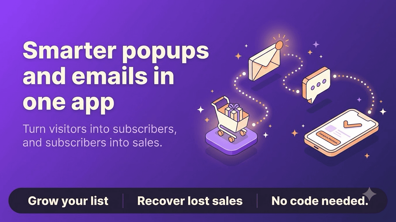
HustlePop's promotional artwork connects popup engagement with a longer customer relationship. For the first campaign, make the signup and the promised next step work together.
Review mobile, accessibility and repeat exposure
Place the popup on a test theme or a controlled campaign before a full launch. On a phone, verify that the form can be closed, the keyboard does not hide the submit button, text remains legible and the customer can continue to the product after declining. On desktop, check the popup against the store's navigation and any other overlays.
Look beyond the visual preview. Is the email field clearly labeled? Can a keyboard user reach the close control and submit button? Does the popup obscure a price, size selection or checkout action at a decisive moment? The listing's “scales for phones and desktops” description is a design capability, not proof that a specific store theme passes these checks.
Run a small launch and learn from it
Start with one collection or campaign and compare the experience before increasing exposure. Track the number of times the popup is shown, how often it is completed and whether the resulting signups can be used as intended—using the measurement tools actually available in the installed setup. If the app or analytics stack does not expose a metric, do not invent it.
Consider a simple review after the first week: Were signups concentrated on pages where the offer was relevant? Did customers dismiss it immediately? Did discount codes work? Were there support questions about the offer? These observations guide a specific edit—headline, page placement, trigger or promise—more reliably than changing every element at once.
Give the first comparison a useful question
For a suggested guide-signup campaign, compare a plain form with the same form and a supporting product image. Keep the offer, page and trigger consistent. Review whether customers understand the promised guide and whether submitted addresses reach the intended follow-up. For a discount campaign, compare a clear code reveal with a wheel only if both use the same genuine offer conditions. That separates the value of the interaction from the value of a different discount.
If customers sign up but then ask how to use the code, improve the success message and the restrictions. If the popup receives immediate dismissals, revisit the timing and the reason to subscribe. Neither finding requires rebuilding every block.
The current Shopify listing shows HustlePop as free. Check the live listing before installing or budgeting, because app terms can change. Visit the official website for additional product information.
Frequently asked questions
Does HustlePop send marketing emails after capture?
The public listing establishes popup creation and an in-app searchable subscriber list. It does not, by itself, establish a complete automated email service. Check the workflow you intend to use after the form is submitted.
Can I choose when the popup opens?
Yes. The listing names delay, scroll-depth and exit-style rules. Test the chosen trigger on the actual product or collection page, especially on mobile.
Is a spin wheel better than a simple signup form?
Not universally. A wheel adds an interaction and can reveal a configured discount code. Use it when the experience fits the offer; a clear, low-friction form may be better for a straightforward guide or update.
Is a newsletter signup the same as a back-in-stock request?
No. A newsletter signup asks to hear more from the store; a restock request concerns a particular unavailable item. Match the form's promise to the follow-up you can deliver rather than treating every email capture as the same customer need.
A strong popup is a short, truthful invitation at the right point in the journey. HustlePop supplies the visual canvas and display rules; the store supplies the reason to subscribe, the real offer and the follow-through.